Introduction
A grid layout is a set of measurements used to position elements or components on a page based on successive columns and rows. With the daily demand for responsive web design, using grids in web applications has become a necessity. It is almost impossible to assemble a web layout without incorporating a grid system. Grid layouts significantly increase any web application's aesthetic value and user experience.
Material UI comes with its grid system that helps developers create a responsive grid layout that adjusts to any screen size or orientation, ensuring consistency across layouts. This article will deeply explore Material UI Grid, its features, implementations, and limitations in any React application.
Steps we'll cover:
- Introduction
- What is Material UI?
- Getting Started with Material UI Grid
- How to use Material UI Grid in your React project?
- Building a simple Blog Page UI with Material UI Grid
- Material UI Grid Drawbacks
- Conclusion
What is Material UI?
Material UI is a free and open-source library based on Material Design. It provides predefined and customizable React UI components to help with web development. More developers have incorporated Material UI into their projects over the years because it simplifies and speeds up the web design process.
Material UI provides different categories of components, including Navigation components, Input components, Data Display components, Feedback components, Layout components, e.t.c. The Material UI Grid is a perfect example of the Layout components.
Install the Material UI library as a dependency in your project's package.json with the following command:
Use npm
npm install @mui/material @emotion/react @emotion/styled
Use yarn
npm install @mui/material @emotion/react @emotion/styled
Getting Started with Material UI Grid
The Material Design's grid system is visually balanced based on a 12-column grid layout. It provides a container that allows visual consistency across different screen sizes and viewports. You can use the <Grid /> component to implement Material Design’s grid system in your React application.
When using Material UI Grid:
- Item widths are set in percentages to ensure the layouts are adaptive to all screen sizes.
- You can create space between individual grid items with
padding - The grid has five breakpoints:
xs,sm,md,lg, andxl. - The breakpoint can be assigned an value that indicates how many of the 12 columns are occupied by the component when it reaches that width.
Note that: The Grid /> component employs Flexbox properties for greater flexibility.
How to use Material UI Grid in your React project?
To get started, import the <Grid /> component into your project like this:
import Grid from "@mui/material/Grid";
or;
import { Grid } from "@mui/material";
Containers and Items
Typically, Material UI Grid provides two types of layouts; containers and items. The container prop provides the CSS properties of a flex container to the Grid /> component, and the item prop provides the CSS properties of a flex child.
The items need to be wrapped in a container:
import Grid from "@mui/material/Grid";

return (
  <>
    {/* A flexbox container represented in an Material UI Grid container */}
    <Grid container>
      Container
      {/* A Child grid container */}
      <Grid item>
        <div>A flex item</div> {/* A simple flex item */}
      </Grid>
    </Grid>
  </>
);
Spacing
To create space between grid child items, you can use the spacing prop that accompanies the <Grid /> component. Any positive number and including decimals can be used as the spacing value.
Consider the code below:
import React, { useState } from "react";
import Grid from "@mui/material/Grid";
import FormControlLabel from "@mui/material/FormControlLabel";
import RadioGroup from "@mui/material/RadioGroup";
import Radio from "@mui/material/Radio";
import Paper from "@mui/material/Paper";
import { Camera } from "@mui/icons-material";

//create our style
const styles = {
  paper: {
    height: 100,
    width: 100,
    color: "#808080",
  },

  radio: {
    backgroundColor: "#808080",
    color: "#fff",
  },
};

const MUIspacing = () => {
  //Make our variable for spacing. The default value is 0.
  const [spacing, setSpacing] = useState(0);

  //When executed, change the value of the spacing Hook to the value specified.
  const changeSpacing = (e) => {
    setSpacing(Number(e.target.value));
  };
  return (
    <div>
      <div>
        {/* User will determine spacing according to their preference*/}
        <Grid container spacing={spacing}>
          {/*Rethreeder 3 empty black boxes as items of this container*/}
          {[0, 1, 2].map((value) => (
            <Grid key={value} item>
              <Camera style={styles.paper} />
            </Grid>
          ))}
        </Grid>
      </div>
      <div>
        <Paper>
          <div>
            {/* Show user's chosen spacing value*/}
            {spacing}
            <RadioGroup
              name="spacing"
              aria-label="spacing"
              value={spacing.toString()}
              onChange={changeSpacing}
              row
              style={styles.radio}
            >
              {/*Create a form with multiple spacing values. */}
              {[0, 1, 2, 3, 4, 5, 6, 7, 8, 9, 10].map((value) => (
                <FormControlLabel
                  key={value}
                  value={value.toString()}
                  control={<Radio />}
                  label={value.toString()}
                />
              ))}
            </RadioGroup>
          </div>
        </Paper>
      </div>
    </div>
  );
};

export default MUIspacing;
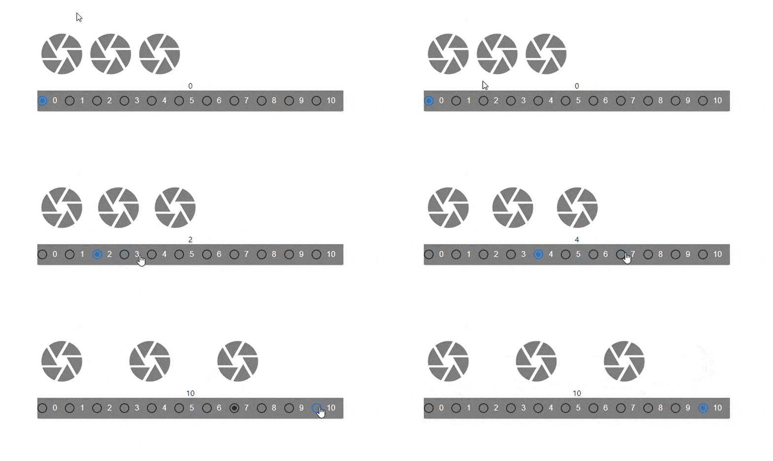
The code above showcases a dynamic change of the spacing prop value. There are three grid elements(camera icons), each interactively spaced with every click of a radio button that corresponds with the spacing value.
Here’s the result:

Fluid Grids
Fluid Grids in Material UI use column widths and breakpoints to scale grid items and resize content within them. We can create layouts for different screen sizes using the breakpoint props (xs, sm, md, lg, and xl) on the grid items.
Basic Fluid Grids
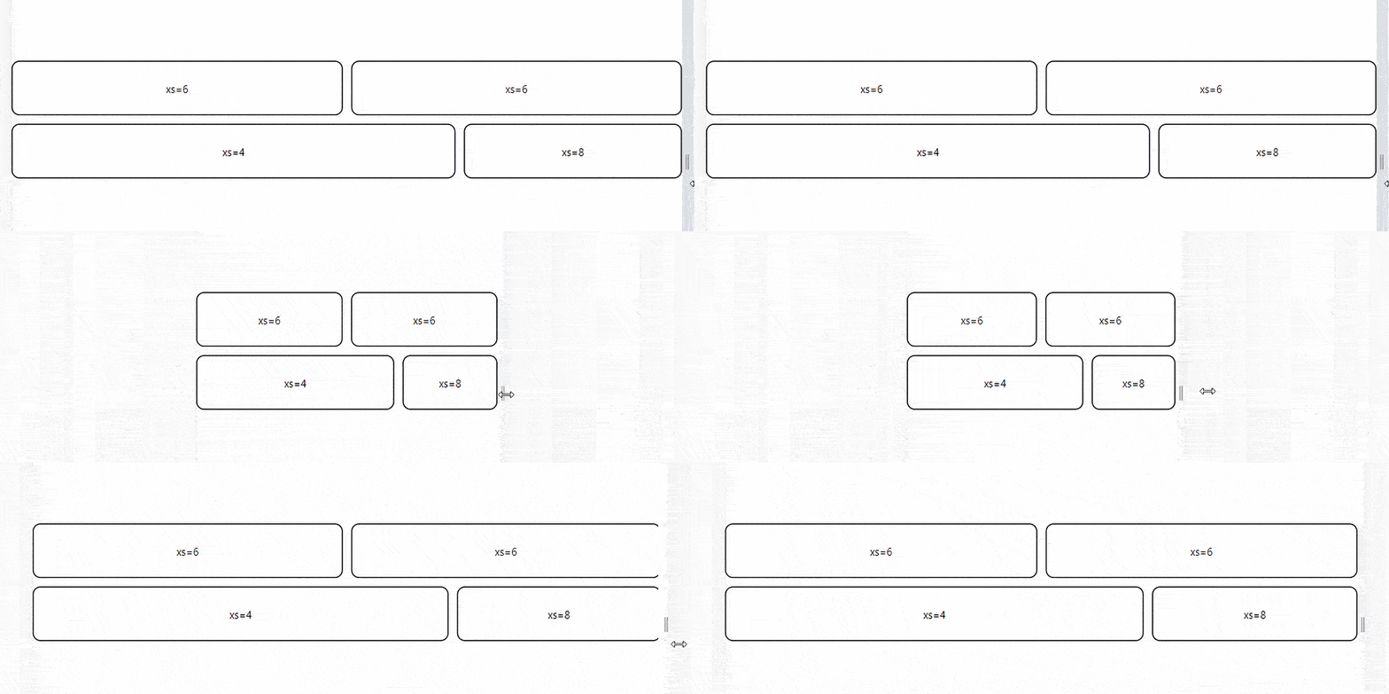
Basic Fluid Grids provide column widths that are represented with integer values from 1 to 12. They are applicable at any breakpoint and indicate how many columns the component occupies. A value assigned to a breakpoint applies to all preset width modifications.
Here’s a simple illustration of how to use Basic Fluid Grids in Material UI.
import React from "react";
import Box from "@mui/material/Box";
import Grid from "@mui/material/Grid";
import "../App.css";

const BasicGrid = () => {
  return (
    <Box sx={{ flexGrow: 1 }}>
      {/* Setting up the Fluid Grid system */}
      <Grid container spacing={2}>
        <Grid item xs={6}>
          <div className="grid-elements">xs=6</div>
        </Grid>
        <Grid item xs={6}>
          <div className="grid-elements">xs=6</div>
        </Grid>
        <Grid item xs={8}>
          <div className="grid-elements">xs=4</div>
        </Grid>
        <Grid item xs={4}>
          <div className="grid-elements">xs=8</div>
        </Grid>
      </Grid>
    </Box>
  );
};

export default BasicGrid;
Here’s the result;

Fluid Grids with multiple breakpoints
Components may be defined with multiple widths, causing the layout to change at the defined breakpoint. Width values assigned to larger breakpoints precede those assigned to smaller ones.
For examplexs={12} sm={6} sizes a component to takes half of the 6 columns when viewport width is minimum 600px or above. The component fills all 12 available columns in smaller viewports.
Consider the code below:
import * as React from "react";
import Box from "@mui/material/Box";
import Grid from "@mui/material/Grid";

const ComplexFluidGrid = () => {
  return (
    <Box sx={{ flexGrow: 1 }}>
      <Grid container spacing={2}>
        <Grid item xs={6} md={8}>
          <div className="grid-elements">xs=6 md=8</div>
        </Grid>
        <Grid item xs={6} md={4}>
          <div className="grid-elements">xs=6 md=4</div>
        </Grid>
        <Grid item xs={6} md={4}>
          <div className="grid-elements">xs=6 md=4</div>
        </Grid>
        <Grid item xs={6} md={8}>
          <div className="grid-elements">xs=6 md=8</div>
        </Grid>
      </Grid>
    </Box>
  );
};

export default ComplexFluidGrid;
The code above is a simple Material UI Grid system with four grid children elements. The elements are set to take space according to a 3:1 ratio when the screen size is 600 px or greater and a 2:2 percentage when the screen size is 600px or less.
Here’s the result:

Auto Layout
The auto-layout feature allows grid items to auto-resize and occupy available space without specifying the item’s width. You can set the width for an item and have all others resize to fit.
Consider the code below:
import * as React from "react";
import Box from "@mui/material/Box";
import Grid from "@mui/material/Grid";

const AutoGrid = () => {
  return (
    <Box sx={{ flexGrow: 1 }}>
      <Grid container spacing={3}>
        <Grid item xs>
          <div className="grid-elements">xs</div>
        </Grid>
        <Grid item xs={6}>
          <div className="grid-elements">xs=6</div>
        </Grid>
        <Grid item xs>
          <div className="grid-elements">xs</div>
        </Grid>
      </Grid>
    </Box>
  );
};

export default AutoGrid;
The code above depicts three grid elements. The middle element is set to take half the screen's width while the other two dynamically take the space remaining on either side.

Nested Grids
You can combine the container and item props so that the <Grid /> component can act as both a flex container and a child item. This allows us to have another grid set within the grid item.
Consider the code below:
import * as React from "react";
import Box from "@mui/material/Box";
import Grid from "@mui/material/Grid";

function NestedGrid() {
  return (
    <React.Fragment>
      <Grid item xs={4}>
        <div className="grid-elements">Grid Element</div>
      </Grid>
      <Grid item xs={4}>
        <div className="grid-elements">Grid Element</div>
      </Grid>
      <Grid item xs={4}>
        <div className="grid-elements">Grid Element</div>
      </Grid>
    </React.Fragment>
  );
}

export default function NestedGridGroup() {
  return (
    <Box sx={{ flexGrow: 1 }}>
      <Grid container spacing={1}>
        <Grid container item spacing={3}>
          <NestedGrid />
        </Grid>
        <Grid container item spacing={3}>
          <NestedGrid />
        </Grid>
        <Grid container item spacing={3}>
          <NestedGrid />
        </Grid>
      </Grid>
    </Box>
  );
}
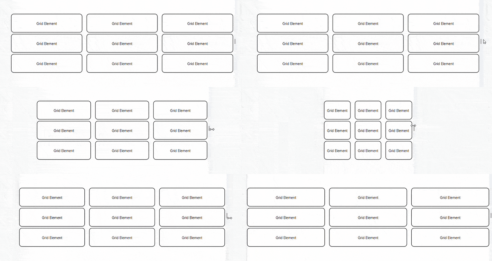
The code above showcases a nested Material UI Grid system. The <FrontRow /> component is a grid setup called inside another <Grid /> component multiple times to produce a result like this:

Building a simple Blog Page UI with Material UI Grid
Material UI Grid assists developers with the measurements needed to create a more easily responsive UI. This can be depicted in a simple Blog Page layout created with React and Material UI. Material UI Grid is used in three app components; Blog, FeaturedPost, and MainFeaturedPost.
The <MainFeaturedPost/> Component
This component contains all the elements in the blog layout's main featured post section.
Study the code:
import * as React from "react";
import Paper from "@mui/material/Paper";
import Typography from "@mui/material/Typography";
import Grid from "@mui/material/Grid";
import Box from "@mui/material/Box";

function MainFeaturedPost(props) {
  const { post } = props;

  return (
    <Paper
      sx={{
        position: "relative",
        backgroundColor: "grey.800",
        color: "#fff",
        mb: 4,
        backgroundSize: "cover",
        backgroundRepeat: "no-repeat",
        backgroundPosition: "center",
        backgroundImage: `url(${post.image})`,
      }}
    >
      {
        <img
          style={{ display: "none" }}
          src="https://refine.ams3.cdn.digitaloceanspaces.comundefined"
          alt={post.imageText}
        />
      }
      <Box
        sx={{
          position: "absolute",
          top: 0,
          bottom: 0,
          right: 0,
          left: 0,
          backgroundColor: "rgba(0,0,0,.3)",
        }}
      />
      <Grid container>
        <Grid item md={6}>
          <Box
            sx={{
              position: "relative",
              p: { xs: 3, md: 6 },
              pr: { md: 0 },
            }}
          >
            <Typography component="h3" variant="h2">
              {post.title}
            </Typography>
            <Typography variant="h5" color="inherit" paragraph>
              {post.description}
            </Typography>
            {post.linkText}
          </Box>
        </Grid>
      </Grid>
    </Paper>
  );
}

export default MainFeaturedPost;
<FeaturedPost/> component
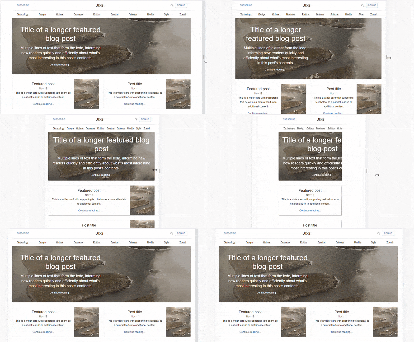
This component holds the elements in the Blog page layout featured posts section. There are two of them, and they are set the share the available screen space in a 3:6 ratio when the viewport is 600px or more. They are also set to stack on top of each other when the viewport is 600px or less.
Study the code below:
import * as React from "react";
import Typography from "@mui/material/Typography";
import Grid from "@mui/material/Grid";
import Card from "@mui/material/Card";
import CardActionArea from "@mui/material/CardActionArea";
import CardContent from "@mui/material/CardContent";
import CardMedia from "@mui/material/CardMedia";

function FeaturedPost(props) {
  const { post } = props;

  return (
    <Grid item xs={12} md={6}>
      <CardActionArea component="a" href="#">
        <Card sx={{ display: "flex" }}>
          <CardContent sx={{ flex: 1 }}>
            <Typography component="h2" variant="h5">
              {post.title}
            </Typography>
            <Typography variant="subtitle1" color="text.secondary">
              {post.date}
            </Typography>
            <Typography variant="subtitle1" paragraph>
              {post.description}
            </Typography>
            <Typography variant="subtitle1" color="primary">
              Continue reading...
            </Typography>
          </CardContent>
          <CardMedia
            component="img"
            sx={{ width: 160, display: { xs: "none", sm: "block" } }}
            image={post.image}
            alt={post.imageLabel}
          />
        </Card>
      </CardActionArea>
    </Grid>
  );
}

export default FeaturedPost;
The <Blog/> Component
This component handles housing and displays the other components with the Material UI grid.
Here’s the code for the Blog component:
import * as React from "react";
import CssBaseline from "@mui/material/CssBaseline";
import Grid from "@mui/material/Grid";
import Container from "@mui/material/Container";
import { createTheme, ThemeProvider } from "@mui/material/styles";
import Header from "./Header";
import MainFeaturedPost from "./MainFeaturedPost";
import FeaturedPost from "./FeaturedPost";

const sections = [
  { title: "Technology", url: "#" },
  { title: "Design", url: "#" },
  { title: "Culture", url: "#" },
  { title: "Business", url: "#" },
  { title: "Politics", url: "#" },
  { title: "Opinion", url: "#" },
  { title: "Science", url: "#" },
  { title: "Health", url: "#" },
  { title: "Style", url: "#" },
  { title: "Travel", url: "#" },
];

const mainFeaturedPost = {
  title: "Title of a longer featured blog post",
  description:
    "Multiple lines of text that form the lede, informing new readers quickly and efficiently about what's most interesting in this post's contents.",
  image: "https://source.unsplash.com/random",
  imageText: "main image description",
  linkText: "Continue reading…",
};

const featuredPosts = [
  {
    title: "Featured post",
    date: "Nov 12",
    description:
      "This is a wider card with supporting text below as a natural lead-in to additional content.",
    image: "https://source.unsplash.com/random",
    imageLabel: "Image Text",
  },
  {
    title: "Post title",
    date: "Nov 11",
    description:
      "This is a wider card with supporting text below as a natural lead-in to additional content.",
    image: "https://source.unsplash.com/random",
    imageLabel: "Image Text",
  },
];

const theme = createTheme();

export default function Blog() {
  return (
    <ThemeProvider theme={theme}>
      <CssBaseline />
      <Container maxWidth="lg">
        <Header title="Blog" sections={sections} />
        <main>
          <MainFeaturedPost post={mainFeaturedPost} />
          <Grid container spacing={4}>
            {featuredPosts.map((post) => (
              <FeaturedPost key={post.title} post={post} />
            ))}
          </Grid>
        </main>
      </Container>
    </ThemeProvider>
  );
}
We have a simple Blog Layout created with React and Material UI.

Material UI Grid Drawbacks
Some of the drawbacks of using Material UI Grid include:
Negative Margin
Material UI employs a negative margin to create space between grid items. This could result in unexpected behaviors. To apply a background color, for example, you must use display: flex; on the parent grid element.
white-space no-wrap
On flex items, the default setting is min-width: auto. This causes a positioning conflict when the child uses the white-space: nowrap. You can set min-width: 0 to ensure that the item stays within the container.
In practice, you can set the zeroMinWidth property as follows:
<Grid item xs zeroMinWidth>
  <Typography noWrap>
 </Grid>
direction: column | column-reverse
direction="column" and direction="column-reverse" containers do not support the xs, sm, md, lg, and xl props. These breakpoints are primarily concerned with controlling width and have no effect on height within column containers.
Conclusion
This article covered Material UI Grid, its features, application and installment inside any React application. We also further explored the Material UI Grid functionalities in a simple Blog post Layout. Despite the limitations enlisted above, Material UI Grid aids developers in creating a responsive and interactive web user interface. I hope this article becomes valuable to you.
Meet the headless, React-based solution to build sleek CRUD applications. With Refine, you can be confident that your codebase will always stay clean and boilerplate-free.
Try Refine to rapidly build your next CRUD project, whether it's an admin panel, dashboard, internal tool or storefront.
Refine is an open-source, React-based framework for building CRUD applications without constraints. It’s headless by design and seamlessly works with any custom design or UI framework you favor. For convenience, it ships with ready-made integrations for Ant Design, Material UI and Mantine UI.
It can speed up your development time up to 3X without compromising freedom on styling, customization and project workflow.
Visit Refine GitHub repository for more information, demos, tutorials, and example projects.


