Introduction
Radix is an open-source headless library that provides components for creating user-friendly, high-quality React online applications and design systems. It offers a wide range of accessible headless primitives, meant to expedite development by providing frequently used UI elements such as dialogues, selections, accordions, tabs, and more. In this article, we will illustrate how to build components with Radix.
Radix Building Blocks
Radix consists of four building blocks: Primitives, Colours, Icons and Themes. These tools can be used to create comprehensive design systems. Let's take a deeper look at each product and see how they can be utilised independently or together to meet your needs.
Primitives
Radix Primitives is a UI component library that helps you create high-quality, user-friendly design systems and web applications. It is a collection of low-level UI component libraries with a focus on accessibility, customisation, and the developer experience. These components can be used as the foundation of your design system or added to it incrementally.
Radix Primitives was designed with the goal of creating controllable headless components. All of its wiring is done internally, allowing you to start using the components as soon as possible.
The Components are also shipped with zero styles, providing you complete styling control. Components can be styled using any styling method (vanilla CSS, CSS preprocessors/frameworks, CSS-in-JS libraries).
Here is an example of a Radix accordion primitive
import * as Accordion from "@radix-ui/react-accordion";

export default () => (
  <Accordion.Root type="single" defaultValue="item-1" collapsible>
    <Accordion.Item value="item-1">
      <Accordion.Header>
        <Accordion.Trigger>This is an accordion</Accordion.Trigger>
      </Accordion.Header>
      <Accordion.Content>
        Yes. It's unstyled by default, giving you freedom over the look and
        feel.
      </Accordion.Content>
    </Accordion.Item>
  </Accordion.Root>
);
The primitive also have access to props which are listed here.

Radix provides a large number of primitives, including accordions, dialog boxes, popovers, dropdowns, labels, and many more. To check out those, visit here.
To view the list of Radix Primitives, visit here.
Colours
Radix Colours is a meticulously created colour system used to create aesthethically pleasing web applications. Radix Colours includes a set of scales that are JavaScript objects designed to work with CSS to CSS-in-JS alternatives (for example, styled-components). It also bundles the colours as raw CSS files which you can import straight into your files when using a bundler like Parcel or Webpack.
To view more on Radix Colors, visit here.
Icons
Radix Icons provides a set of 15×15 icons that are accessible as separate components and can be installed as a single package which you can import in your React components. Radix Icons are also accessible in other formats, including downloadable SVGs, Figma, and Sketch files.
To view more on Radix Icons, visit here.
Themes
Radix Themes is a pre-styled component library that works out of the box and requires minimum configuration.
Radix Themes doesn't include a styling system. There are no CSS or SX props, and no styling libraries are used inside. It's made with standard CSS. However, the themes can be customised by altering the token system's CSS variables. The list of the variables supported by the token system is listed here.
This article will include explanations for the Reset, Grid, and Theme components. However, to see more components that themes provide, visit here.
Reset component
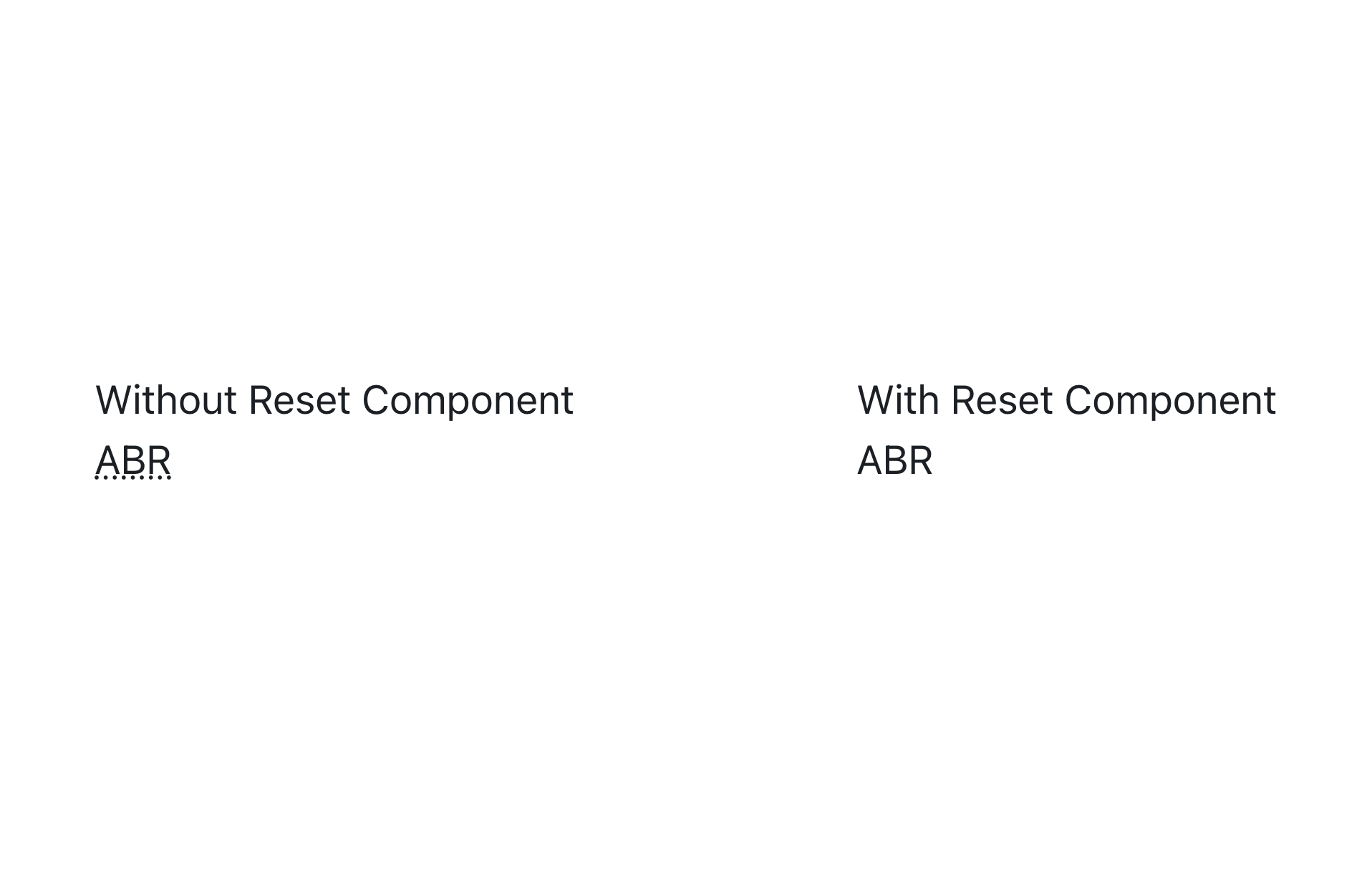
TheReset component is used to forcibly reset browser styles for a specified element.
Under the hood, it generates a Slot primitive (a Radix primitive) which does the following:
- Accepts one
Reactelement as its child. - Removes opinionated browser styles.
- Sets idiomatic layout defaults, such as
display: blockfor photos orwidth: Stretchfor inputs. - Sets the cursor style based on your theme settings.
- Adds the property
box-sizing: border-box.
An example of the Reset component in use is illustrated in the code below:
import { Reset } from "@radix-ui/themes";

function App() {
  return (
    <div>
      <div className="flex gap-2">
        <div className="w-6/12">
          <h1>Without Reset Component</h1>
          <abbr title="Abbreviation">ABR</abbr>
        </div>

        <div className="w-6/12">
          <h1>With Reset Component</h1>
          <Reset>
            <abbr title="Abbreviation">ABR</abbr>
          </Reset>
        </div>
      </div>
    </div>
  );
}
View:
Grid component
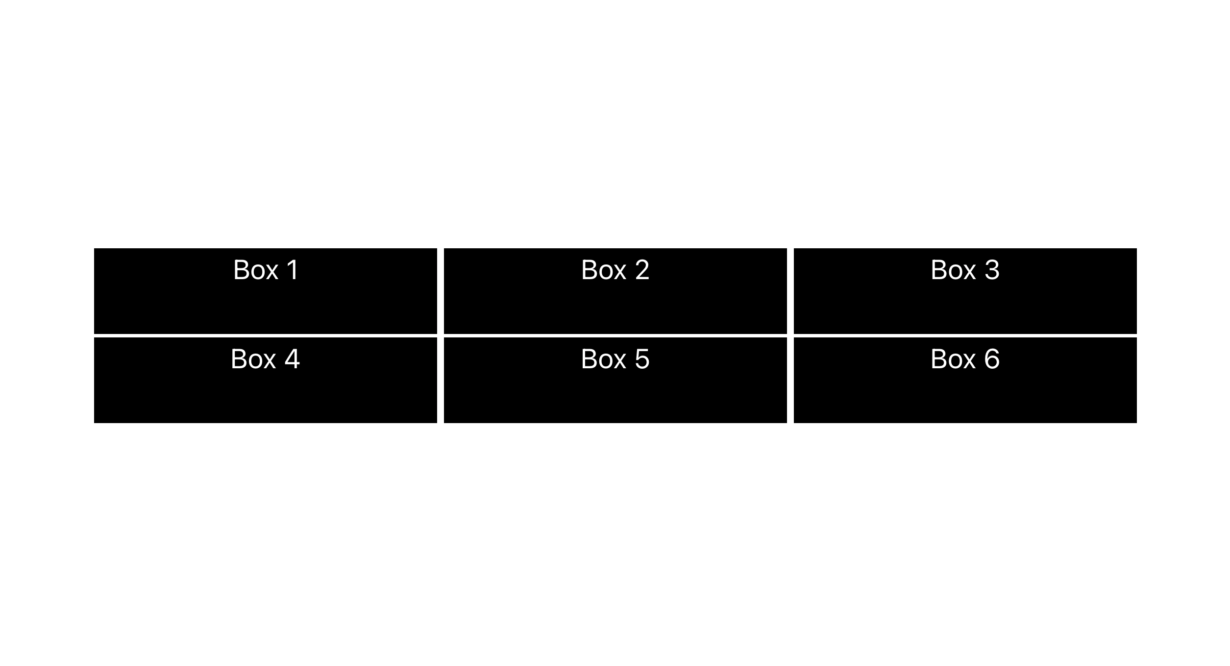
The Grid component is a component for designing grid layouts. This component is based on the div element and accepts common margin props.
An example of the Grid component in use is illustrated in the code below:
import { Grid, Box } from "@radix-ui/themes";

function App() {
  return (
    <div>
      <Grid columns="3" gap="3" rows="repeat(3, 40px)" width="auto">
        <Box
          width={"200px"}
          height={"50px"}
          className="bg-black text-center text-white"
        >
          Box 1
        </Box>
        <Box
          width={"200px"}
          height={"50px"}
          className="bg-black text-center text-white"
        >
          Box 2
        </Box>
        <Box
          width={"200px"}
          height={"50px"}
          className="bg-black text-center text-white"
        >
          Box 3
        </Box>
        <Box
          width={"200px"}
          height={"50px"}
          className="bg-black text-center text-white"
        >
          Box 4
        </Box>
        <Box
          width={"200px"}
          height={"50px"}
          className="bg-black text-center text-white"
        >
          Box 5
        </Box>
        <Box
          width={"200px"}
          height={"50px"}
          className="bg-black text-center text-white"
        >
          Box 6
        </Box>
      </Grid>
    </div>
  );
}
View:
Theme component
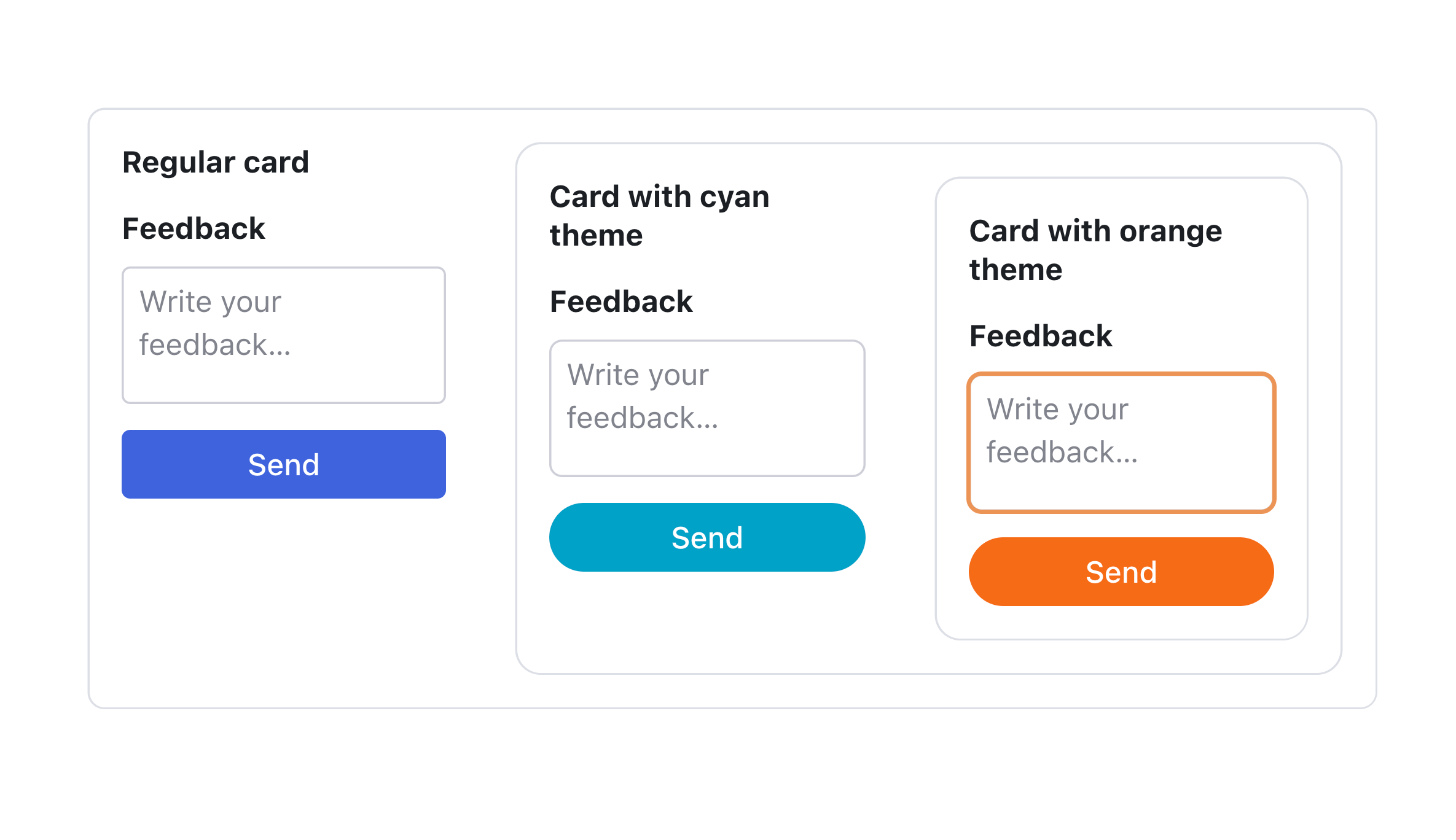
The Theme component wraps all or portion of a React tree to enable theme customisation.
An example of the Theme component in use is illustrated in the code below:
import {
  Grid,
  Button,
  TextArea,
  Heading,
  Flex,
  Card,
  Theme,
  Text,
} from "@radix-ui/themes";

function App() {
  return (
    <div>
      <Card size="2">
        <Flex gap="6">
          <Flex direction="column" gap="3">
            <Heading as="h5" size="2">
              Regular card
            </Heading>
            <Grid gap="1">
              <Text as="div" weight="bold" size="2" mb="1">
                Feedback
              </Text>
              <TextArea placeholder="Write your feedback…" />
            </Grid>
            <Button>Send</Button>
          </Flex>

          <Theme accentColor="cyan" radius="full">
            <Card size="2">
              <Flex gap="6">
                <Flex direction="column" gap="3">
                  <Heading as="h5" size="2">
                    Card with cyan theme
                  </Heading>
                  <Grid gap="1">
                    <Text as="div" weight="bold" size="2" mb="1">
                      Feedback
                    </Text>
                    <TextArea placeholder="Write your feedback…" />
                  </Grid>
                  <Button>Send</Button>
                </Flex>

                <Theme accentColor="orange">
                  <Card size="2">
                    <Flex direction="column" gap="3">
                      <Heading as="h5" size="2">
                        Card with orange theme
                      </Heading>
                      <Grid gap="1">
                        <Text as="div" weight="bold" size="2" mb="1">
                          Feedback
                        </Text>
                        <TextArea placeholder="Write your feedback…" />
                      </Grid>
                      <Button>Send</Button>
                    </Flex>
                  </Card>
                </Theme>
              </Flex>
            </Card>
          </Theme>
        </Flex>
      </Card>
    </div>
  );
}
According to the code, cards wrapped in the Cyan and Orange themes reflected these themes on their cards, whilst cards that were not wrapped in the theme reflected Radix's default theme.
View:
Setup Radix in your React Project
- First, we'll develop a React application. We can achieve this with Vite or CRA. However, Vite is highly recommended.
Installing Primitives
To install a primitive component, add the name of the component to a
radix-ui/prefix as shown in the example below:# with npm
npm install @radix-ui/react-popover@latest -E
# with yarn
yarn add @radix-ui/react-popover@latest -Eimport the parts of the primitive as shown below:
import * as React from "react";
import * as Popover from "@radix-ui/react-popover";

const PopoverDemo = () => (
  <Popover.Root>
    <Popover.Trigger>More info</Popover.Trigger>
    <Popover.Portal>
      <Popover.Content>
        Some more info…
        <Popover.Arrow />
      </Popover.Content>
    </Popover.Portal>
  </Popover.Root>
);

export default PopoverDemo;
Add styles to the primitives
javascript:import * as React from "react";
import * as Popover from "@radix-ui/react-popover";
import "./styles.css";
const PopoverDemo = () => (
<Popover.Root>
<Popover.Trigger className="PopoverTrigger">Show info</Popover.Trigger>
<Popover.Portal>
<Popover.Content className="PopoverContent">
Some content
<Popover.Arrow className="PopoverArrow" />
</Popover.Content>
</Popover.Portal>
</Popover.Root>
);
export default PopoverDemo;CSS:/* styles.css */
.PopoverTrigger {
background-color: white;
border-radius: 4px;
}
.PopoverContent {
border-radius: 4px;
padding: 20px;
width: 260px;
background-color: white;
}
.PopoverArrow {
fill: white;
}
Installing Themes
To install Themes, type the command below on your terminal:
# with npm
npm install @radix-ui/themes

# with yarn
yarn add @radix-ui/themes
Next, import the styles to the entrypoint of your application
import '@radix-ui/themes/styles.css';Add the Theme import to the entrypoint of the application()
import "@radix-ui/themes/styles.css";
import { Theme } from "@radix-ui/themes";

export default function () {
  return (
    <Theme>
      <MyApp />
    </Theme>
  );
}
Start adding the themes components to your application
import { Flex, Text, Button } from "@radix-ui/themes";

export default function MyApp() {
  return (
    <Flex direction="column" gap="2">
      <Text>Hello from Radix Themes :)</Text>
      <Button>Let's go</Button>
    </Flex>
  );
}
Installing Icons
To install colors type the command below:
# with npm
npm install @radix-ui/react-icons

# with yarn
yarn add @radix-ui/react-icons
Import the Icons into your project
import { FaceIcon, ImageIcon, SunIcon } from "@radix-ui/react-icons";

function MyComponent() {
  return (
    <div>
      <FaceIcon />
      <SunIcon />
      <ImageIcon />
    </div>
  );
}
Installing Colors
To install colors, type the command below on your terminal
# with npm
npm install @radix-ui/colors

# with yarn
yarn add @radix-ui/colors
Vanilla CSS
Radix Colours gives the colours as raw CSS files. When using a bundler like Parcel or Webpack, you can simply import them into your files.
/* Import only the scales you need */
@import '@radix-ui/colors/gray.css';
@import '@radix-ui/colors/blue.css';
@import '@radix-ui/colors/green.css';
@import '@radix-ui/colors/red.css';
@import '@radix-ui/colors/gray-dark.css';
@import '@radix-ui/colors/blue-dark.css';
@import '@radix-ui/colors/green-dark.css';
@import '@radix-ui/colors/red-dark.css';

/* Use the colors as CSS variables */
.button {
  background-color: var(--blue-4);
  color: var(--blue-11);
  border-color: var(--blue-7);
}
.button:hover {
  background-color: var(--blue-5);
  border-color: var(--blue-8);
}
Component Objects
Radix Colours can also be provided as Objects that can be incorporated into any React project.
import {
  gray,
  blue,
  red,
  green,
  grayDark,
  blueDark,
  redDark,
  greenDark,
} from "@radix-ui/colors";
Build components with Radix
This article will include sample components for Dialogs and Slider.
Dialogs
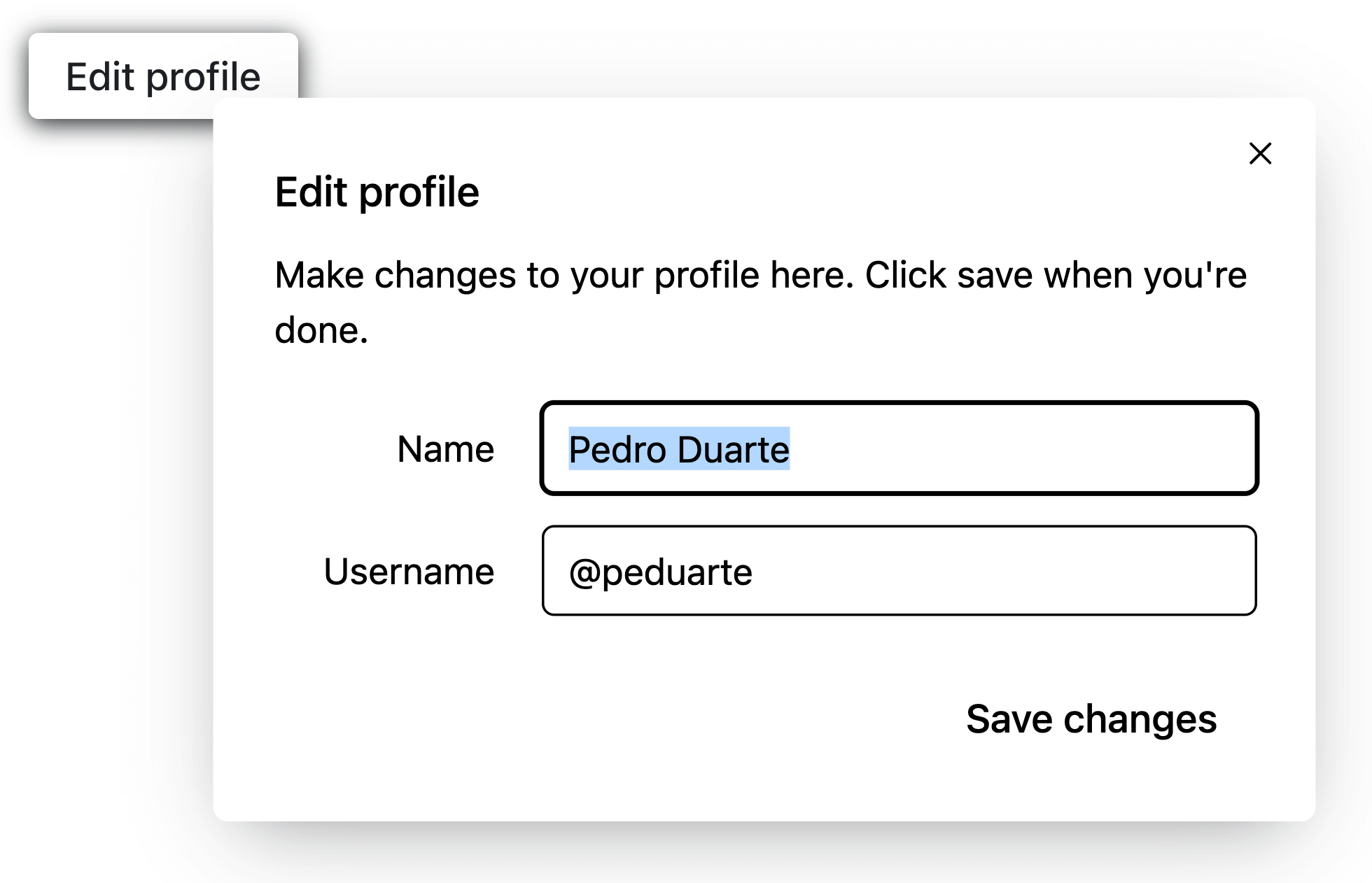
The anatomy of a Dialog with Radix consists of the following eight elements:
- Root: Contains all the components of a Dialog.
- Trigger: Contains the button that will be used to trigger the Dialog.
- Portal: When used, it move your overlay and content elements into the
bodyelement in the DOM. - Overlay: This is a layer that, when the dialog is open, covers the inactive area of the view.
- Content: Contains holds the contents of the dialog.
- Title: THolds the title of the content when the dialog is opened.
- Description: Holds the description of the content when the dialog is opened.
- Close: Holds the button that closes the dialog.
The code of a Dialog using Radix primitives and Tailwind classes is shown below:
import * as Dialog from "@radix-ui/react-dialog";
import { Cross2Icon } from "@radix-ui/react-icons";

function App() {
  return (
    <div style={{ marginTop: "150px" }}>
      <Dialog.Root>
        <Dialog.Trigger asChild>
          <button className="text-violet11 shadow-blackA4 hover:bg-mauve3 inline-flex h-[35px] items-center justify-center rounded-[4px] bg-white px-[15px] font-medium leading-none shadow-[0_2px_10px] focus:shadow-[0_0_0_2px] focus:shadow-black focus:outline-none">
            Edit profile
          </button>
        </Dialog.Trigger>

        <Dialog.Portal>
          <Dialog.Overlay className="bg-blackA6 data-[state=open]:animate-overlayShow fixed inset-0" />
          <Dialog.Content className="data-[state=open]:animate-contentShow fixed top-[50%] left-[50%] max-h-[85vh] w-[90vw] max-w-[450px] translate-x-[-50%] translate-y-[-50%] rounded-[6px] bg-white p-[25px] shadow-[hsl(206_22%_7%_/_35%)_0px_10px_38px_-10px,_hsl(206_22%_7%_/_20%)_0px_10px_20px_-15px] focus:outline-none">
            <Dialog.Title className="text-mauve12 m-0 text-[17px] font-medium">
              Edit profile
            </Dialog.Title>
            <Dialog.Description className="text-mauve11 mt-[10px] mb-5 text-[15px] leading-normal">
              Make changes to your profile here. Click save when you're done.
            </Dialog.Description>
            <fieldset className="mb-[15px] flex items-center gap-5">
              <label
                className="text-violet11 w-[90px] text-right text-[15px]"
                htmlFor="name"
              >
                Name
              </label>
              <input
                className="text-violet11 shadow-violet7 focus:shadow-violet8 inline-flex h-[35px] w-full flex-1 items-center justify-center rounded-[4px] px-[10px] text-[15px] leading-none shadow-[0_0_0_1px] outline-none focus:shadow-[0_0_0_2px]"
                id="name"
                defaultValue="Pedro Duarte"
              />
            </fieldset>
            <fieldset className="mb-[15px] flex items-center gap-5">
              <label
                className="text-violet11 w-[90px] text-right text-[15px]"
                htmlFor="username"
              >
                Username
              </label>
              <input
                className="text-violet11 shadow-violet7 focus:shadow-violet8 inline-flex h-[35px] w-full flex-1 items-center justify-center rounded-[4px] px-[10px] text-[15px] leading-none shadow-[0_0_0_1px] outline-none focus:shadow-[0_0_0_2px]"
                id="username"
                defaultValue="@peduarte"
              />
            </fieldset>
            <div className="mt-[25px] flex justify-end">
              <Dialog.Close asChild>
                <button className="bg-green4 text-green11 hover:bg-green5 focus:shadow-green7 inline-flex h-[35px] items-center justify-center rounded-[4px] px-[15px] font-medium leading-none focus:shadow-[0_0_0_2px] focus:outline-none">
                  Save changes
                </button>
              </Dialog.Close>
            </div>
            <Dialog.Close asChild>
              <button
                className="text-violet11 hover:bg-violet4 focus:shadow-violet7 absolute top-[10px] right-[10px] inline-flex h-[25px] w-[25px] appearance-none items-center justify-center rounded-full focus:shadow-[0_0_0_2px] focus:outline-none"
                aria-label="Close"
              >
                <Cross2Icon />
              </button>
            </Dialog.Close>
          </Dialog.Content>
        </Dialog.Portal>
      </Dialog.Root>
    </div>
  );
}
View:
Slider
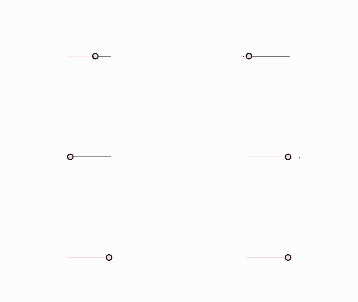
The following four components make up the anatomy of a Slider made with Radix:
- Root: Comprising every component of a slider
- Track: The Slider-containing track.
- Range: The portion of the range that has to fit inside the slider.
- Thumb: The thumb can be moved.
The code of a Slider using Radix primitives and Tailwind classes is shown below:
import * as Slider from "@radix-ui/react-slider";

function App() {
  return (
    <div>
      <Slider.Root
        className="relative flex items-center select-none touch-none w-[200px] h-5"
        defaultValue={[50]}
        max={100}
        step={1}
      >
        <Slider.Track className="bg-black relative grow rounded-full h-[3px]">
          <Slider.Range className="absolute bg-red-100 rounded-full h-full" />
        </Slider.Track>
        <Slider.Thumb
          className="block w-5 h-5 bg-red-100 shadow-[0_2px_10px] shadow-blackA4 rounded-[10px] hover:bg-violet3 focus:outline-none focus:shadow-[0_0_0_5px] focus:shadow-blackA5"
          aria-label="Volume"
        />
      </Slider.Root>
    </div>
  );
}
View:
Conclusion
In this article, we looked at Radix, discussed Radix's Primitives, Colours, Icons, and Themes, and finally built components with Radix Primitives. Radix is an outstanding component library that you should consider using if you want to create design systems or visually appealing web apps.

